I can no longer stay silent: it’s time to talk about the CITY CONNECT jerseys.
I have THOUGHTS. I have OPINIONS. I have (according to my little brother) HOT and CONTROVERSIAL TAKES. I have questions about the amount of black fabric Nike is apparently trying to unload.
Iykyk but let’s talk about what the City Connect project is all about (other than selling overpriced jerseys).
From the official press release: “Designed in collaboration with Nike, City Connect jerseys showcase the vibrant and distinct culture of your team and their city. Each MLB City Connect jersey incorporates elements that pay homage to the team’s history, local landmarks, and community pride”
So that is, according to Nike, the goal of this project. When I’m looking at the City Connects, here’s what I’m thinking about and judging them on:
1. Does this make an effort to meaningfully connect with the city or community that this team is based in?
2. Does the jersey/uni actually look GOOD in photos, on the field, etc?
3. Is the uniform a significant deviation from the traditional “look” of the team?
My brother tried to argue that Point #1 is irrelevant to what I should think of the actual uniform but that’s because he’s a teenage boy who incorrectly thinks the best CC is the Cincinnati Reds one.
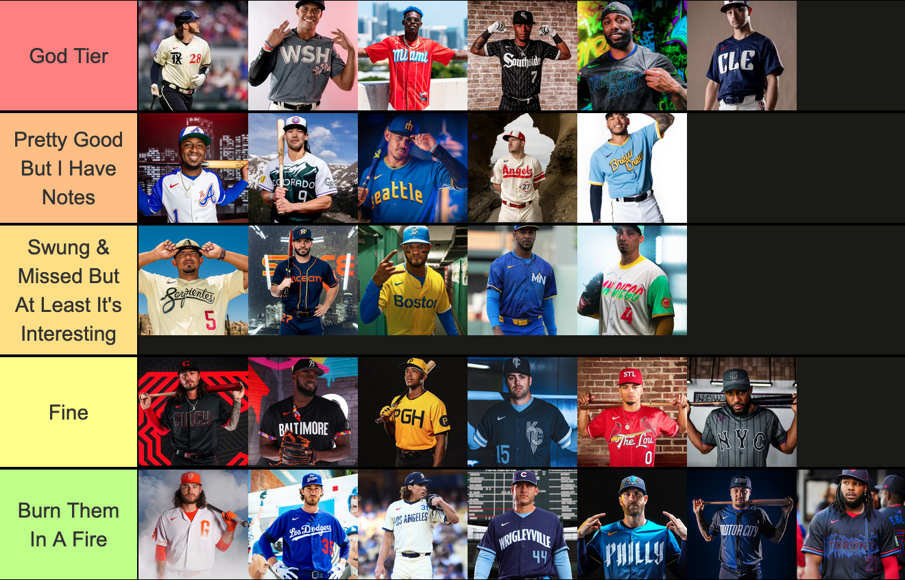
So: I’ve broken the jerseys into different TIERS that will each have their own post. Let’s start at the top with GOD TIER.
The Texas Peagles

Debuted April 21, 2023
Is it a hot take to say that I fucking love these?
Full disclosure: I am from Texas. And growing up in Austin, we make a lot of jokes about the Dallas/Fort Worth/Arlington Metroplex. I believe I joked that the Rangers city connects would be a Vineyard Vines polo. But these indisputably rule. THEY INVENTED A MYTHICAL CREATURE! Also, the pants are technically navy (not black) and they look cool as fuck.
Aesthetically, I think these look great. They don’t look like any other current uniform on the field, they are a massive departure from the Rangers other uniforms, they are visually interesting to look at and easy to read from a distance.
The Washington Cherry Blossoms

Debuted April 9, 2022
Gorgeous, subtle, beautiful homage to the Washington DC cherry blossoms. A national travesty that these are being retired at the end of this season. YES the hats should be pink, but given that these were one of the earliest City Connects, teams weren’t making unhinged choices yet and I respect the subtlety.
These uniforms look good on the field and in photos, it’s a deviation from the Nationals typical uniforms, and I think it’s a massive success.
Miami Marlins

Debuted May 21, 2021
These are cool as fuck. They’re a pretty direct homage to the Cuban Sugar Kings (1954-1960). The colors are bold and bright, they feel extremely Miami (way more than the boring as fuck uniforms they normally wear) and – while I am normally anti red/white/blue uniforms, it’s overdone – I think this is a really refreshing spin on it!
The Chicago White Sox

Debuted June 5, 2021
This is the only acceptable all-black uniform!!!!! Ignoring the White Sox complete and ongoing meltdown on the baseball field, they have a very strong visual identity (black & white, pinstripes, gothic script) and these uniforms do a fantastic job of remixing that.
Obviously, this very directly “connects” to the community that they’re tied to in Chicago. But like, I want to wear this jersey in my life. It just rules. It looks fantastic on the field. Every other black uniform looks like it’s ripping this one off. I fucking love it! And they didn’t even chicken out and pair it with white pants!!!
The Tampa Bay Rays

Debuted May 3, 2024
EMPHATIC FUCK YES. I need to lead with this: there is a skateboarding ray. Sorry, I was sold the second that shit happened.

Once again: these pass the HELL YES test. The neon? Chef’s kiss. The gradient stripe down the pants? EXACTLY. The colors rule. These don’t look like any other baseball uniform I’ve seen (complimentary). It connects to Tampa EXTREMELY well, it feels authentic to the franchise, it doesn’t look like any of their other uniforms. This passes with FLYING COLORS.
The Cleveland Guardians

Debuted May 17, 2024
Perhaps my hottest take is that I think these are great!! Here’s the thing: they can’t use basically any of their past iconography because it’s extremely racist, so they’re basically starting from square one here! Initially I was very meh on these. But I really like the art-deco font – it adds an interesting texture to the jersey. I am always pro-striping down the pants.
They do a great job of connecting to Cleveland (the city) and have some callbacks to the Cleveland uniforms from the 80s and 90s. It’s walking a super fine line between nodding to the past while redefining the look of the team. I like it and I am pro!
And THERE WE HAVE IT. The God-Tier city connect jerseys. See you next week to fight about Pretty Good But I Have Notes!


